
An order management dashboard is the single operational workspace that shows live order status, key KPIs, allocation health, and fulfillment alerts, with one-click paths to line-level troubleshooting. According to NetSuite's documentation, it gives managers a unified place to review KPIs, monitor allocations, and act on alerts, all without switching between systems.
The five elements every manager expects to see at a glance:
- Order Scorecard — headline KPIs like fill rate, order volume, and inventory turnover
- Order Summary — filterable list of all orders with status, value, and fulfillment ETA
- Order Operations by Channel — per-channel breakdown of orders, revenue, and allocation pressure
- Sales Order Allocation Alerts — exception flags for out-of-stock, backorder, and payment holds
- Allocation Automation Status — health of automated allocation jobs over a rolling window
The immediate payoff is situational awareness: you see what is healthy (green), what needs attention (orange), and what is broken (red), then click directly into the problem order to fix it.
Key Takeaways
An order management dashboard gives food operators a single workspace to monitor KPIs, triage allocation alerts, and act on exceptions before they reach customers.
| Point | Details |
|---|---|
| Start with alerts, not the list | Open the Alerts section first each morning to catch exceptions before reviewing routine orders. |
| KPIs need thresholds | Set alert thresholds for fill rate, days-of-inventory remaining, and cancellation rate to trigger exceptions automatically. |
| One-click drilldown is non-negotiable | A well-configured dashboard lets you reach line-level order details in one or two clicks, per TIBCO's design guidance. |
| Channel views isolate problems | Per-channel summaries reveal whether a fill-rate drop is systemic or limited to one marketplace or delivery partner. |
| Stovoo for food operators | Stovoo's purpose-built dashboard covers subscription orders, catering bookings, and perishable inventory flags out of the box. |
Table of Contents
- What does an order management dashboard actually show?
- What KPIs belong in the Order Scorecard?
- How do you use order summary modes and drill into a specific order?
- Why does the channel view matter for daily operations?
- What are the sales order allocation alert types and how do you triage them?
- How do you read the allocation automation status tile?
- How do you design a dashboard that is fast to scan and fast to act from?
- The dashboard routine that actually works in practice
- Why food businesses get more from a purpose-built dashboard
- Sources
- FAQ
What does an order management dashboard actually show?
Think of the dashboard as a tile-based control center. Each tile answers one operational question, and clicking it takes you straight to the underlying order list, filtered and ready to act on.
Here is a simple tile map for a typical layout:
- Top row: Order Scorecard (KPIs) | Allocation Automation Status (7-day health)
- Middle row: Order Operations by Channel | Sales Order Allocation Alerts
- Bottom row: Order Summary (full filterable list)
Fluent Commerce's OMS documentation groups tiles into two categories: Orders and Alerts. That separation matters because it lets you scan the Alerts section first each morning and only move to the Orders section when no critical exceptions are firing.
Clicking a tile applies its filters automatically and navigates to the underlying order list, which means a manager can go from "I see a red allocation alert" to the specific affected orders in a single click. Pango's order tracking platform extends this further by aggregating carrier events into the same workspace, so you can reroute shipments or trigger customer notifications without opening a separate carrier portal.

Pro Tip: Set your dashboard's default landing view to the Alerts section, not the full order list. You will catch exceptions before they become customer complaints.
What KPIs belong in the Order Scorecard?
The scorecard is the first tile you read each morning. It shows whether the business is healthy or heading toward a fulfillment problem. For food businesses, where perishable inventory and delivery windows are non-negotiable, these numbers carry extra weight. A food business analytics guide covers how to apply these KPIs specifically to reduce waste and optimize fulfillment cycles.
| KPI | What It Measures | Act When… |
|---|---|---|
| Total order volume | Orders received in the period | Spikes unexpectedly (check inventory) or drops (check channel health) |
| Fill rate | Orders fulfilled completely vs. total orders | Falls below your target threshold |
| Inventory turnover | How fast stock sells through | Drops (slow-moving SKUs) or spikes (risk of stockout) |
| On-time fulfillment rate | Orders delivered by promised date | Trends down over 3+ days |
| Average inventory value | Capital tied up in stock | Rises without a corresponding volume increase |
| Order cancellation rate | Cancellations as a share of total orders | Rises above baseline (signals allocation or payment issues) |
Geckoboard's inventory dashboard example adds days-of-inventory remaining and sell-through rate as two of the most practical replenishment signals, because they tell you not just what you have, but how long it will last.
Pro Tip: For perishable food inventory, treat days-of-inventory remaining as your primary exception trigger. Set a threshold alert at two days of stock remaining so procurement has time to act before a stockout hits live orders.
How do you use order summary modes and drill into a specific order?
The Order Summary tile is where you move from awareness to action. Most platforms offer multiple summary modes: all orders, recent orders, and high-priority exceptions. Filters narrow the list by channel, order status, promised delivery date, payment state, or location.
Typical summary columns include:
- Order reference number
- Customer name and contact
- Order status (pending, allocated, shipped, exception)
- Order value
- Fulfillment ETA
- Payment state
A TotalMobile order management guide confirms that column customization and status-based filters are standard in commercial dashboards, letting managers build saved views for their most common searches.
Step-by-step drilldown: from a delayed alert to a line-level fix
- Spot the alert. The Allocation Alerts tile turns orange. Click it.
- Review the filtered order list. The dashboard shows only orders with allocation delays, sorted by promised date.
- Open the order. Click the order reference to reach the order-level view: customer details, line items, allocated warehouse, and carrier assignment.
- Identify the issue. One line item shows insufficient stock at the assigned location.
- Act. Reassign the line to an alternate location, split the fulfillment, or flag for backorder, all from the order detail page.
- Confirm and close. Update the customer-facing ETA and save. The alert clears when allocation resolves.
From the order detail view, a manager should be able to: update the delivery address, retry a failed payment, split a shipment, reassign to a different fulfillment location, add an internal note, and trigger a customer notification. Online payment handling guides for food operators explain how payment retries and address corrections can be handled without leaving the dashboard workspace.
Why does the channel view matter for daily operations?
Channel-level order operations show how each sales channel (your website, a marketplace, a catering booking form, a subscription plan) is performing individually. The tile typically displays order count, potential revenue, and allocation pressure per channel.
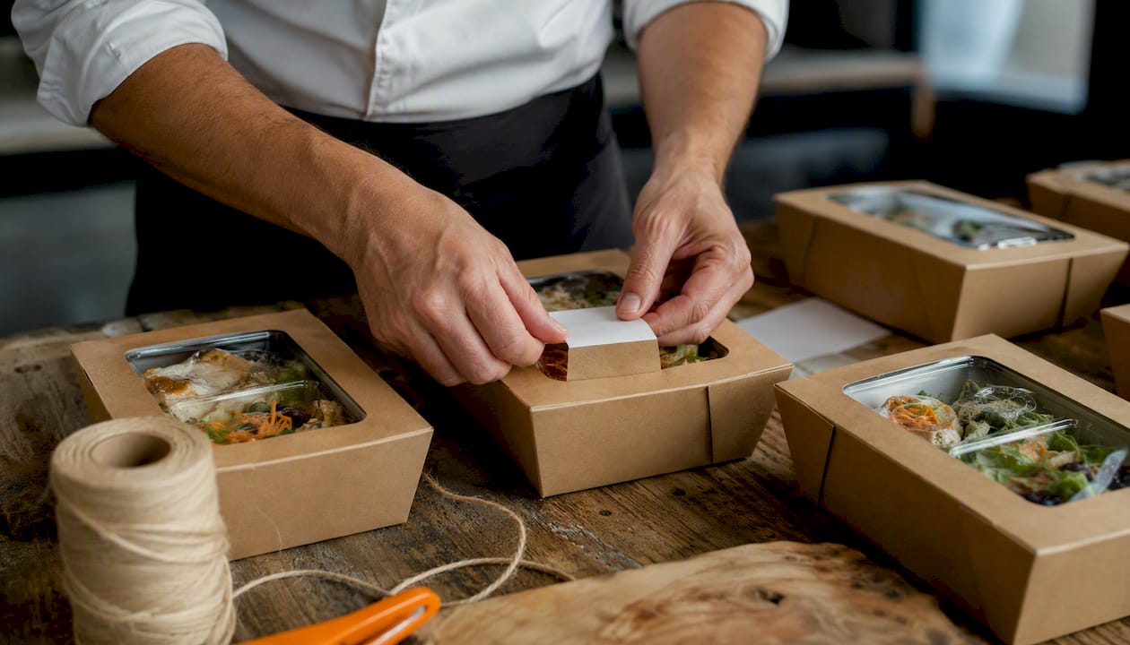
The value shows up fast when one channel goes wrong. A sudden fill-rate drop on a single marketplace while others stay healthy points to a channel-specific inventory rule or a shipping integration issue, not a systemic problem. A surge in cancellations on your subscription channel often signals a billing failure, not a fulfillment one.
Common signals to watch per channel:
- Fill rate dropping on one channel while others hold steady
- Cancel rate rising on a specific marketplace or delivery partner
- Shipping delays concentrated in one region or carrier assignment
- Revenue per order trending down (possible discount or pricing error)
Pro Tip: Use channel filter presets to save a "subscription orders" view and a "catering bookings" view separately. Mixing them in one list makes it harder to spot channel-specific patterns early. For food delivery context, this partner guide on online food ordering covers how channel-level visibility shapes operational decisions.
NetSuite's platform collects per-channel allocation and sales data over recent periods to populate these channel summaries, which means the tile reflects actual allocation history, not just today's snapshot.
What are the sales order allocation alert types and how do you triage them?
Allocation alerts are the dashboard's early-warning system. Each alert type points to a different root cause and a different first response.
| Alert Type | Likely Cause | Immediate Response |
|---|---|---|
| Out-of-stock | Inventory depleted before order fulfilled | Check replenishment ETA; offer backorder or substitute |
| Insufficient allocation | Stock exists but not enough assigned to this order | Reallocate from another location or channel |
| Allocation delay | Automated job stalled or inventory feed lagged | Check automation status tile; rerun job manually |
| Over-allocation | More stock assigned than physically available | Audit inventory counts; release excess allocation |
| Backorder required | Lead time exceeds promised delivery date | Notify customer; update ETA or offer cancellation |
| Payment hold | Payment failed or flagged for review | Retry payment or contact customer; hold fulfillment |
Triage checklist
- Sort alerts by promised delivery date, closest first.
- Separate out-of-stock alerts from delay alerts (different fix paths).
- For payment holds, check whether the issue is a card decline or a fraud flag.
- Escalate to procurement if out-of-stock affects more than one order for the same SKU.
- Escalate to customer service if the promised date has already passed.
- Escalate to your fulfillment partner if allocation delays repeat across multiple orders in the same window.
How do you read the allocation automation status tile?
The automation status tile shows whether your allocation rules are running correctly. It typically reports recent job runs, success and failure counts, and the exceptions each job produced. NetSuite recommends a seven-day rolling window for this tile, which is short enough to surface recurring failures without burying the operator in historical noise.
Key signals to watch:
- A single failure in seven days: likely transient; monitor and move on.
- Failures on the same job two or three days running: a rule condition or inventory feed is broken.
- Rising exception counts with no failures: the rules are running but producing more exceptions, which means demand or inventory has shifted outside the rule parameters.
Troubleshooting flow for automation failures
- Open the automation status tile and identify the failing job name.
- Check the inventory feed timestamp. A stale feed (older than your sync interval) is the most common cause.
- Review the rule conditions for that job. A recent product or location change may have invalidated a condition.
- Check open purchase orders. If expected stock has not arrived, the rule may be trying to allocate inventory that does not exist yet.
- Rerun the job manually after fixing the feed or rule.
- Monitor for one full cycle to confirm the fix held.
Automation in catering operations follows a similar troubleshooting logic: identify the broken input, fix it, and verify the next automated cycle before closing the issue.
How do you design a dashboard that is fast to scan and fast to act from?
The best dashboards do two things well: they surface exceptions immediately, and they let you act on those exceptions without navigating away. TIBCO's design guidance recommends that managers can reach line-level order details in one or two clicks from any summary tile.
Fluent Commerce's threshold-based alerting approach uses color coding (green, orange, red) driven by configurable thresholds, so teams practice management-by-exception rather than reviewing every order manually. For food businesses, set the red threshold for perishable inventory at two days of stock remaining and for on-time fulfillment at any drop below your agreed service level.
UX checklist for a well-configured dashboard:
- Meaningful defaults: the dashboard opens on the Alerts section, not a blank summary
- Role-filter presets: ops lead, fulfillment team, and customer service each see their relevant tiles first
- Mobile-friendly layout: managers on the floor can check alerts without a desktop
- Clear action buttons: "Fix Order," "Retry Payment," and "Reassign Location" visible from the order detail view
- Saved filter views: channel presets, date-range presets, and exception-only views ready to apply in one click
Daily workflow playbook
Morning health check (5 minutes): Open the scorecard, scan fill rate and cancellation rate against yesterday's baseline, then check the Alerts tile for any red flags before the first dispatch window.
Mid-day exception triage (10 minutes): Filter the Order Summary to exceptions only, work through allocation alerts by promised date, and resolve or escalate each one.
Pre-dispatch verification: Confirm all orders scheduled for today's delivery window are fully allocated and have a carrier assignment.
End-of-day reconciliation: Review the automation status tile for any job failures, check channel summaries for anomalies, and note any KPIs trending in the wrong direction for tomorrow's morning check.
Pro Tip: Build a "today's dispatches" saved filter that shows only orders with a promised date of today, sorted by fulfillment ETA. Running this view at pre-dispatch takes two minutes and catches last-minute allocation gaps before the carrier picks up.
The dashboard routine that actually works in practice
Most operations managers spend too much time in the Order Summary list and not enough time in the Alerts section. The productive habit is the reverse: start with the scorecard (30 seconds to confirm nothing is catastrophically wrong), move immediately to the red and orange alert tiles, resolve or escalate each one, and only then open the full order list for routine checks.
A practical daily routine looks like this:
- Morning: Scorecard first, then Alerts. Handle every red tile before touching the order list.
- Mid-shift: Exception triage using the "exceptions only" filter. Escalate anything that needs procurement or customer service.
- Pre-dispatch: Run the "today's dispatches" view. Confirm allocation and carrier assignment for every order in the window.
- End of day: Automation status tile. Check for job failures and note any KPI trends.
Role-specific views make this faster. An ops lead needs the full scorecard and channel summaries. A fulfillment team member needs the allocation alerts and the dispatch queue. A customer service rep needs the order detail view with payment status and delivery ETA visible at a glance. Configuring these as saved presets means each person opens the dashboard and sees exactly what they need to act on, without filtering from scratch every time.
Why food businesses get more from a purpose-built dashboard
Generic order management dashboards cover the basics, but food operators deal with constraints that generic tools handle poorly: perishable inventory with hard expiry windows, subscription billing that recurs on a fixed cadence, catering orders that span multiple delivery dates, and delivery windows measured in hours rather than days.
A purpose-built food business dashboard has these constraints built into its default tile configuration. Perishable inventory flags surface automatically. Subscription order cadences appear as a distinct order type. Catering bookings show their event date alongside the fulfillment ETA so nothing gets confused with a standard delivery.
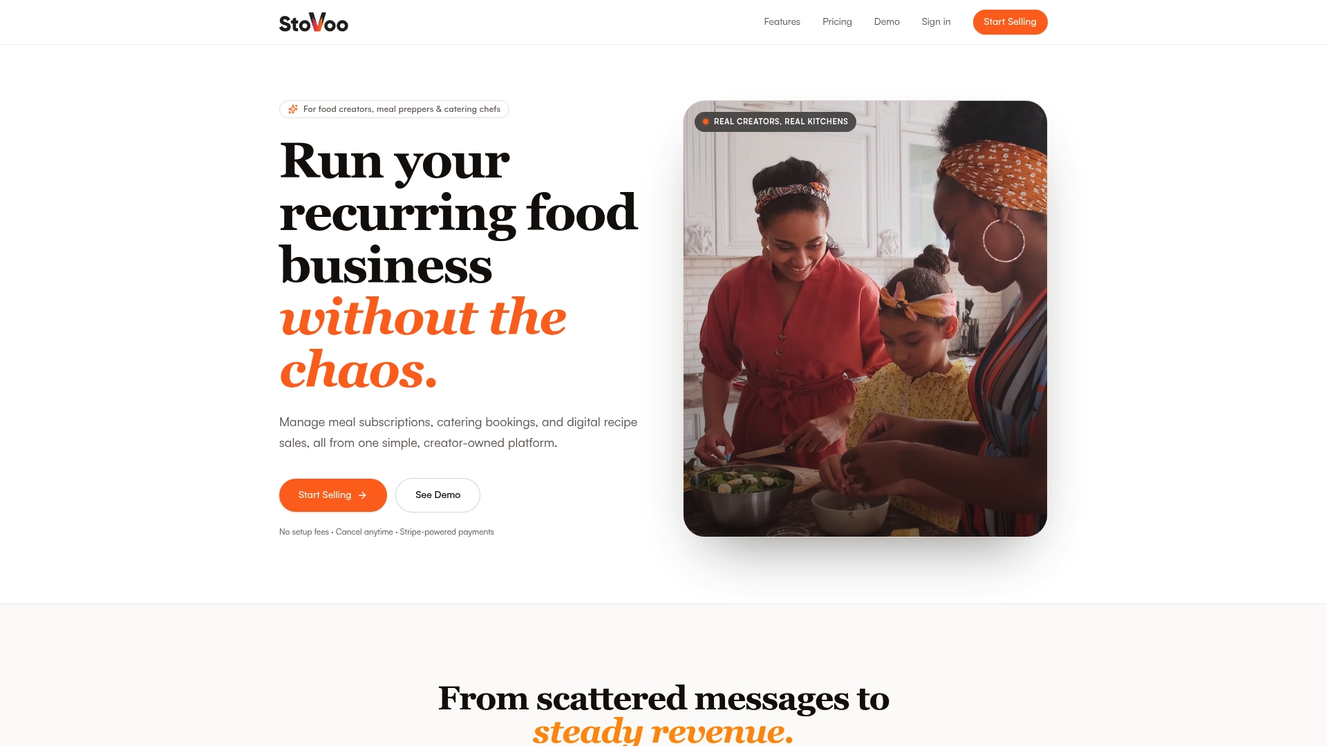
Stovoo is built for exactly this scenario. Food creators, meal preppers, and catering operators get a centralized dashboard that manages subscription plans, catering enquiries, digital recipe sales, and customer records in one place, with automated billing and a mobile-first shopfront that feeds orders directly into the dashboard. No spreadsheets, no WhatsApp threads, no manual reconciliation.
The buyer scenarios where a specialized platform like Stovoo makes the most sense: single-operator meal-prep businesses managing weekly recurring orders, catering chefs handling multi-date event bookings, and food creators selling both physical meal plans and digital recipes from the same storefront. Integration points to verify before you commit to any platform: payment processor compatibility, shipping or carrier connections, and inventory sync frequency.
Browse live shopfront examples like Culater Catering's dashboard-driven storefront to see how catering orders flow into a centralized view, or start selling on Stovoo to set up your own dashboard in minutes.
Sources
- NetSuite Applications Suite - Order Management Dashboard
- TIBCO Order management dashboard user guide (drill-down guidance)
- Fluent OMS Web App
- Inventory Dashboard Example | Geckoboard
FAQ
What is an order management dashboard?
An order management dashboard is a centralized workspace that displays live order status, key fulfillment KPIs, allocation alerts, and channel-level summaries, with direct links to order-level detail for fast troubleshooting.
Which KPIs should appear on an order scorecard?
Fill rate, total order volume, on-time fulfillment rate, inventory turnover, average inventory value, and order cancellation rate are the core scorecard metrics for most operations teams.
How do you triage allocation alerts effectively?
Sort alerts by promised delivery date, separate out-of-stock from delay alerts (they have different fix paths), and escalate to procurement or customer service when the same SKU appears in multiple alerts.
What does the allocation automation status tile show?
It reports recent job runs, success and failure counts, and exceptions over a rolling seven-day window, so managers can spot recurring failures or rule regressions without reviewing long historical logs.
Is Stovoo a good fit for food businesses managing subscription and catering orders?
Yes. Stovoo's dashboard is purpose-built for food operators, covering subscription billing, catering bookings, perishable inventory flags, and customer management in one place, with no manual reconciliation required.